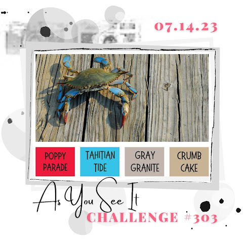
This week is a colour challenge at As You See It Challenges, and it's called Bright 'n Basic and is created by Team Member Heather H. The colours are so vivid but tamed by the neutrals so I'm really happy with it and delighted to get out a new set of dies called the Paper Florist Dies, to try out for the first time.
Here's the Challenge Banner:
Even though it's a bit of an unusual combination of colours, it's a pretty generic one and there are so many different things you can do with it, as you'll see when you view the range of examples from the Design Team. So I hope you'll have fun with it! I thought it would look good with red and blue florals with the neutrals creating interesting backgrounds and foliage and just toning down the brightness a bit. Here's how it turned out:
- Using the Paper Florist dies takes a bit of experimentation. When you open them up at first, they are a bit mysterious looking, but as you try them out you can easily see how they work and how each die can be mixed with the others.
- The one that might stump you at first is the one that looks like this:
This creates a roll up center for a flower like the ones on the two flowers on
the upper right of my card.
- I used the Poppy Parade and Tahitian Tide for the petals and some of the centers. I saved the Crumb Cake for centers and foliage.
- I used the Gray Granite for the sentiment layer, die cut with the largest Stylish Shapes square and embossed in white with a sentiment from the Biggest Wish stamp set. I chose that because everything in this design is scaled in a larger scale, from the flowers to the embossed design so a large, bold sentiment is fitting.
- Speaking of embossing, on the thick Basic White card base, I added another 4" x 5 1/4" layer of thick Basic White embossed using one of the Basics 3D embossing folders with the large polka dots on it.
- Finally I added a multiloop bow using the 1/8" Metallic Woven Ribbon in Tahitian Tide. Using a multiloop bow is one option of getting this bow to be noticed due to its narrow width. You can widen the mesh, but it's hard to keep it wide and any tension on it narrows it back down again.
I recommend this die set for many reasons! It's versatile, useful for home decor and good all year round, and just a lot of fun to play with! It's a little hard to find in the catalogue and you might not have noticed it, since it's not connected to a stamp set, but it's well worth having.
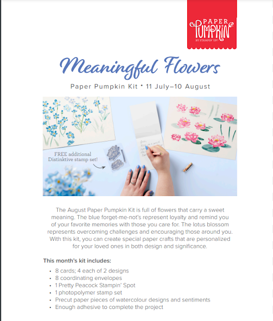
You can now subscribe to August's Paper Pumpkin kit. It's a floral design and you get a free DistINKtive stamp set, so it's really beautiful! The theme is loyalty and encouragement, something we all could use! To subscribe before Aug. 11, click HERE.
If you live in Canada, and don't have a Stampin' Up! demonstrator, I'd love to be yours. I can help you with ideas, get you catalogues and provide you with Stampin' Up products. You can leave a message in the comments or contact me using any of the methods listed in the right side bar at the top of the page. You can shop with me from anywhere in Canada by clicking on the SHOP NOW button in the top menu or clicking on any of products below from my Online Store.

_inPixio.jpg)

_inPixio.jpg)


_inPixio.jpg)


I think this is stunning, Heather! These dies are amazing, and the awesome display you created really shows them off! I don't think I would have thought of this, but I LOVE the neutral leaves and stems!
ReplyDeleteWow, Heather - that's just fabulous! I love those bold diecut flowers!
ReplyDeleteSo this is how you do a color challenge! Brilliant! The boldness of the colors make the flowers just jump off the card. I love the 3D feeling - I really want to touch this card. I tried thru the screen, but it wouldn't let me. Hmmm. Lol. Top notch!
ReplyDeleteThis is just beautiful Heather! I too have been experimenting with these flowers recently - they are great for a crafty play and definitely worthy of experimentation. I love these bold florals toned down with the neutrals - and that fancy bow detail is a great finishing touch!
ReplyDelete