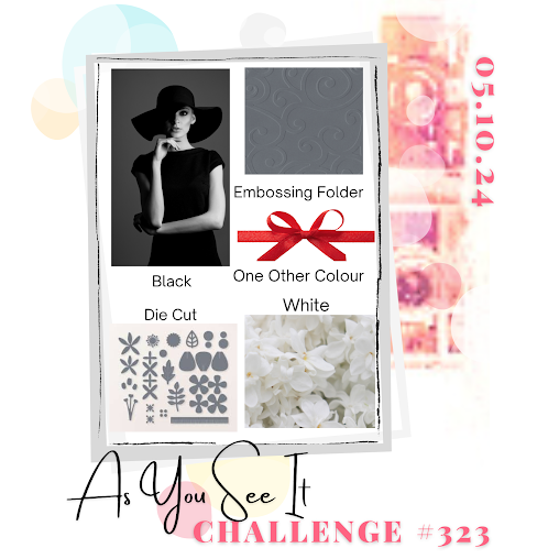
I love Recipe Challenges and the latest one, cooked up by my team mate Jan, is a great one because it's so dramatic, it has a lot of colour ingredients, and it's different from usual. I love that! You've got to keep things interesting, right?
Here's the Challenge Banner:
Although there are a lot of new stamp sets from the 2024/2025 Annual Catalogue I could have chosen for this, I decided to use two sets from the just retired Jan/Apr Mini Catalogue. The sets themselves are not retired however, they were carried over into the new Annual Catalogue. Thank goodness, because I just didn't get enough time to play with them. So I used the Stippled Roses and Wild Ferns bundles. The other reason I chose these two was that I couldn't decide on what the "other colour" would be. I was vacillating between Lemon Lime Twist and Poppy Parade, both colours that are great looks with black and white. I finally decided to do two cards and use both colours, so Stippled Roses would go great with Poppy Parade and Wild Ferns with Lemon Lime Twist!
Anyway, take a look at how they turned out:
- Both cards start out with Basic Black card bases, cut at 5 1/2" x 8 1/2", and scored at 4 1/4".
- The next layer is 4" x 5 1/4" and is Lemon Lime Twist for the Wild Fern card and Poppy Parade for the Stippled Blossom card.
- I cut 2 pieces of 3 3/4" x 5" of Basic White cardstock and embossed each one using the new Dotted Circles 3D embossing folder. Wow! Now that is an enhanced texture! These panels were added to each of the card fronts.
- On a piece of Basic White cardstock, I stamped 3 of the fern images in Lemon Lime Twist as well as the sentiment you see in the photo. Switching to Poppy Parade I stamped the large roses image, the single rose image and the Happy Mother's Day sentiment.
- I die cut all the Wild Fern image and sentiment with dies from the Wild Fern die set.
- I die cut all the roses with dies from the Stippled Roses dies. The sentiment was die cut with a die from the Stylish Shapes dies.
- I die cut a matte for the sentiment with a larger circle die from the Stylish Shapes set and Poppy Parade cardstock.
- I die cut the 'fern frames' to surround the sentiment from Lemon Lime cardstock. A problem I encountered was: to completely surround the sentiment, you need to turn one of those die cuts over, but the backside of the die cut is not as good quality as the front. I remedied that by using what I could of the second border piece and cutting off what didn't fit, then tucking it up where there was no border piece.
- The ferns that had been stamped and die cut were tucked in at two corners.
- I wanted to add some bling, so chose the Iridescent Pearls.
.jpg)
2024–2026 In Color Classic Stampin’ Pads Bundle
2024--2026 In Color 8-1/2" x 11" (21.6 x 27.9 cm) Cardstock
2024–2026 In Color 6" x 6" (15.2 x 15.2 cm) Designer Series Paper
2024–2026 In Color Stampin’ Write Markers
That's well worth the price of the kit on it's own, but no! You still get to select $165 worth of the Stampin' Up! products you love, AND for a minimum of 5 months, you could enjoy a 20% discount on more SU products!
This offer is only good from May 1 - 31 so don't wait!! To Join my team, click
HERE!
If you live in Canada, and don't have a Stampin' Up! demonstrator, I'd love to be yours. I can help you with ideas, get you catalogues and provide you with Stampin' Up products. You can leave a message in the comments or contact me using any of the methods listed in the right side bar at the top of the page. You can shop with me from anywhere in Canada by clicking on the SHOP NOW button in the top menu or clicking on any of products below from my Online Store.

.jpg)

.jpg)
.jpg)
.jpg)

.jpg)
.jpg)


This challenge made me think 'B&W with a pop of colour' but you have turned it all on its head by doing mostly colour on white with a dash of black! I love how fresh that looks on both your cards and I especially like those pretty ferns! Vicky x
ReplyDeleteThanks, Vicky! To be honest, the B&W with a dash of colour was how I thought I was going to do it, too! But my cards seem to take on a life of their own.
DeleteBoth lovely cards Heather - I think I am veering towards favouring the Lemon-Lime Twist one; I just love the bright, almost neon pop of colour and that fern stamp set intrigues me!
ReplyDeleteThank you, Joanne! I felt the same way. But I wish someone would confirm what I am thinking or set me straight. One of those fern frames needs to face the opposite way!!
Delete