I love these Tic Tac Toe Challenges that The Paper Players often have. They are different and fun. My card fits the first column with enamel dots, beach and texture.
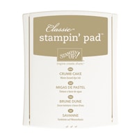
I used the palette from the Color Throwdown challenge with Pool Party/Bermuda Bay blend, Crumb Cake and Whisper White.
And, of course, my theme is nautical which matches the theme for the Global Design Project this week.. Let's take a closer look and I'll explain the watercolour lift technique a little more.
- To do the watercolour lift, you need to use good quality watercolour paper. Stampin' Up!'s is adequate, but more expensive paper would probably work even better. I got the paper spritzed with water, then, using an Aqua Painter dipped in water and picking up the ink in the lid of the stamp pad, I applied strips of various blue green colours, the darker the better, in strips across the paper: Tempting Turquoise, Bermuda Bay and Pool Party. If I was doing this again, I might use only dark colours such as the Bermuda Bay, Tempting Turquoise and maybe Island Indigo for the best results.
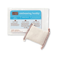
- Make sure you keep your Aqua Painter really wet and blend the colours together well. Choose colours that will blend well and not muddy up your paper when they come in contact with each other. When the paper is covered well, dry naturally or using your heat tool. Dry both front and back of the paper. Liberally douse it with powder from the Embossing Buddy to make sure it's really dry.
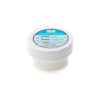
- Stamp repeating images in Versamark Ink and cover with Clear Stampin' Emboss Powder. Heat set the powder until it is clear and shiny.
- Wet your Aqua Painter again, just by dipping in plain water and paint over the surface again, removing colour from the paper. As you remove colour the embossed images will show up better and better, as they will retain the vibrant colour from before under the embossing. Use a paper towel or soft cloth to blot off the excess water (don't rub) and let dry.
- What I learned: Use solid images, which will have a larger area of solid embossing and will show up much better. Use darker inks to start with, as I said before, as it gives more contrast when you remove the colour.
Have a great weekend, and I'll see you back here Monday, bright and early! (Pacific time that is!)
Click on the links below to take you to my On-Line Store, where you can read about, look at, and purchase if you wish, the products used to make this card today.
Product List


This is an awesome nautical card..I love the soft color and textures.Thanks for playing along with the tic tac toe challenge at The Paper Players this week!
ReplyDeleteI love the soft blues of your seaside shore card and a great explanation of this technique - I must give it a go! Thanks for joining us over at The Paper Players this week!
ReplyDeleteI love this technique and it is next on my hit list to show my ladies. It was the perfect choice for our theme this week. Great card Heather! Thanks for joining us at Global Design Project this week.
ReplyDeleteSo much to love! What a great design and so much texture! Thank you for playing along with this week's Color Throwdown!
ReplyDeleteBeautiful! The technique you used looks great with these colors. Thanks for joining us at the Color Throwdown!
ReplyDelete