Showing posts with label Playful Palette Designer Series Paper Stack. Show all posts

Monday, May 22, 2017

Crafting Forever Conundrum for Freshly Made Sketches


I'm having a moment here at Playing with Papercrafting! I've been playing with the sketch from the latest challenge at Freshly Made Sketches and I've come up with two versions of the same card and I can't choose which one I like the best. It's a conundrum! One moment I like the first version, and the next, I think the second version is better! What to do? I'll let you be the judge.

First, here's the sketch:


And here's my first version. Because the background was so vibrant, I went for a plain stamped image with a sepia tone and matched it to the sentiment:


  • I'm playing with tones of Peekaboo Peach and Soft Suede, with Whisper White. The designer paper you see is from the retiring Playful Palette Designer Series Paper Stack, which is still available and 40% off until May 31. I always had a hard time liking that DSP, mostly because of the overly vibrant, busy look of it and the dubious colour combinations, but when you use the single colour pieces and some of the smaller designs, it can be useful. I thought I'd try to use some of it up here and it was one of the few DSP series that featured Peekaboo Peach!
  • I'm using one of my favourite sets from the pre-order, called Crafting Forever*, and this image is my favourite image from the set, I think. Here, I stamped it in Soft Suede to match the background panel behind the designer paper and it gives a bit of a sepia feel to the project.
  • The sentiment is also my favourite from the Crafting Forever set* and I've die cut it with the Stitched Shapes Framelits and backed it with a Scallop Square from the Layering Squares Framelits.

*New products from the 2017-18 Annual Catalogue, available on June 1.

Now take a look at the second version. Here I used watercolour pencils and a blender pen to add some colour to the craft tools in the pot:

  • I love the colouring on it, but I'm not sure that it makes the same impact as the uncoloured image on the bright background. Here I stamped the image in Basic Black Archival Ink and coloured it in with the Pumpkin Pie, Calypso Coral, Real Red, Early Espresso and Basic Gray Watercolour Pencils and blended them with a Blender Pen. Both times, I fussy cut the image with my trusty Paper Snips and mounted them with Stampin' Dimensionals
  • The sentiment was done the same way for both cards.
So there you are. You be the adjudicator! Which version do you like the best?


We're now into our last ten days of the 2016-17 Annual Catalogue and the 2017 Occasions Catalogue! Starting today, Stampin' Up! will stop manufacturing the retiring stamp sets and they will be available only while supplies last! Best get your orders to me quickly so that you don't miss out.


 Every year I find that someone has left it too late to get that set they really wanted and they end up disappointed! Don't let that be you this year!!  Here are the links again that you can use to see what's left and to order on line, or to find the catalogue numbers and prices to let me know what you want.


    **


**Remember that even though a stamp set and its coordinating dies will not be retiring, you will not be able to buy them as a bundle again in the next catalogue, so if you want to save the 10%, you should purchase them before May 31st.


Click on the links below to take you to my On-Line Store, where you can read about, look at, and purchase if you wish, the products used to make this card today.


Product List

Crafting Forever Stamp Set *


*New products from the 2017-18 Annual Catalogue, available on June 1.


Thursday, June 2, 2016

More Pops for Global Design Project


As I write this post, I am sooo tired! Could it have anything to do with staying up late to figure out my first order from the new catalogue?? But it is done and on the way and in about a week, I will have so many amazing products to demonstrate for you! How many of you think that Stampin' Up! has outdone themselves with the new Annual Catalogue? I was able to get quite a few of the new stamps and tools with some incentive rewards I earned so I was excited about that.

But card designing today...not so much! Tiredness is the enemy of mojo for me. But I got out the Pop of Paradise stamp set again today and tried to come up with a card for the Global Design Project Challenge.

Not sure if I succeeded, but oh well! Too late to start over! I have a big class tonight.


  • I think this is one of those cards that looks better from a distance. My DIY gold embossed Designer Series Paper looks pretty busy to me, but I liked the way those images embossed with the Gold Stampin' Emboss Powder. I actually stamped the images on one sheet of Whisper White and split it into two for the sketch.
  • The background DSP* is from the Playful Palette Stack and the stamp set is Pop of Paradise and this blog post is brought to you by the letter P.
  • I kind of love the pineapple image. I kinda love pineapple anyway. Whenever I'm served fruit salad, I always go for the pineapple first. The philodendron leaf reminds me of my first place after I left home. Decorating with plants and greenery was all the rage and the first plant I picked out was a tiny split leaf philodendron, and I was so proud that I kept it alive!
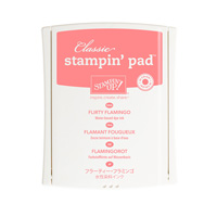
  • The flamingo is really my namesake. When I was in Grade 12, my locker was right outside my biology teacher's door. Whenever he came out in the hall, I was usually standing on one leg, trying to get one of my snow boots off. Thus, I became "Flamingo" to him and everyone else in the school! I suppose there are worse things I could have been called. Here it's stamped in Flirty Flamingo with some touches of Basic Black from the Basic Black Stampin' Write Marker.
  • The sentiment banner is from the same set and it was also embossed in Gold, hand cut and mounted with dimensionals.
(*Designer Series Paper)

That's all for today, folks! I need to get set up for my class, and eat dinner, and maybe I can squeeze in a quick nap before everyone arrives! Thanks for dropping by.


Click on the links below to take you to my On-Line Store, where you can read about, look at, and purchase if you wish, the products used to make this card today.


Product List
Ovals Collection Framelits Die
Ovals Collection Framelits Die**
[129381]


**While I'm waiting for my Layering Ovals Framelits, I using my old retired Ovals Collection Framelits.

Tuesday, May 17, 2016

Playful Painter's Palette Sneak Peek for Pals Paper Arts


Welcome to another sneak peek from your new Annual Stampin' Up! Catalogue! Today I'm showing you the Painter's Palette stamp set* along with the Playful Palette Designer Series Paper Stack*. I love the stamp set! It's really got some cute images, but I gotta be honest - the DSP is a little over the top! I think it's the intensity of the colours that they are trying to put together, but I don't really think they work all that well. That being said, there are some great texture, single colour designs that will be useful. The designs I picked out for today's project are my favourites in the stack, just paint splatters on both Blushing Bride and Basic Black.

*New Products, available June 1st from the 2016-17 Annual Catalogue

I thought that the Painter's Palette stamp set* was a shoe-in for the Pals Paper Arts Challenge this week! They are celebrating their three hundredth challenge this week. Congrats, Pals!


The easel was just the right size for the center square. I put the horizontal flag underneath rather than on top of the easel so the sentiment wouldn't be blocked.


  • I wanted the sentiment from Painter's Palette* to fit inside the easel frame, but I also wanted to add some of the sprinkles of paint and brush strokes as well. To have both, I added the brush strokes and splatters first, but stamped off each image once (twice for the Emerald Envy) before stamping it to give the light tones that wouldn't overpower the sentiment. The sentiment was stamped in Basic Black Archival ink and shows up really well!
  • I die cut the horizontal banner using the Project Life Cards and Label Framelits. I wanted to frame it in Basic Black cardstock, but that is next to impossible using the same framelit. I used my Stampin' Trimmer to cut a piece of black cardstock 4 1/2" x 3/4". I then lined up the top cutting pad in the Big Shot to cover just the very end of the framelit with the paper strip inside and just barely moved the Big Shot - enough to get that shape on the ends. A little trimming with some Paper Snips and I had a backing.
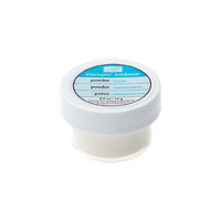
  • The final thing to note about this design is that the whole easel was covered in Versamark ink before I hand trimmed it and Clear Stampin' Emboss Powder sprinkled over all of it. I heat set it with my Heat Tool and it gave a fancy shine to that main element of the card. You might be able to see it better in this next photo:

I hope these sneak peeks are helping you to get excited about the launch of the new Annual Catalogue. I'm having a lot of fun playing with some new products! What's at the top of your wish list from the new catalogue?


Click on the links below to take you to my On-Line Store, where you can read about, look at, and purchase if you wish, the products used to make this card today.


Product List


*New Products, available June 1st from the 2016-17 Annual Catalogue

Painter's Palette Stamp Set*, Playful Palette Designer Series Paper Stack*, Emerald Envy Classic Stampin' Pad*, Peekaboo Peach Classic Stampin' Pad*, Sweet Sugarplum Classic Stampin' Pad*